The viewer

On The Impossibility of Knowing (2 of 4) by JW Harrington

More on this perhaps-enigmatic subject —

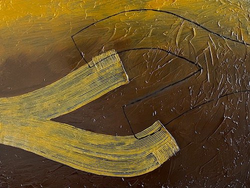
Let’s turn to this painting, The Impossibility of Knowing (34). Here’s what I generally write about this series:

'“‘The Impossibility of Knowing’ refers to the strength of memory and imagination, compared to what is ‘real’ or ‘observed.’ In these paintings, a solid shape, figure, or silhouette interacts with its mirrored outline, against a shadowed or textured background. Something that seems substantive is augmented with its mirror, shadow, future, or past. The interplay creates visual dynamism as each shape is pulled in its opposite direction, and interpretive dynamism as each object or figure interacts with its complement.”

Put less formally, I developed what is admittedly a simple compositional conceit: identifying the principal figure or figures, and mirroring them (right to left or vertically) in outline only. So I’ve got a figure and an echo of the figure. They often interact spatially, creating three sets of patterns:

  • the principal figure,

  • the outline, and

  • the shapes formed by the intersection of figure and outline.

That’s what going on here, in The Impossibility of Knowing (34). To catch the viewer’s eye, I used texture and color in the figure and in the background. The texture base is acrylic gel medium with Ultramarine Blue paint; the other colors are oil paints.
On the impossibility of knowing (1 of 4) by JW Harrington

Lots of folks have asked me what I mean by “The Impossibility of Knowing” as the title of my largest series of paintings. Preparing for talks at two galleries this summer, I had reason to put my meaning into words.

In contemporary art, my viewing preference is non-objective abstraction. Several reasons, but foremost I enjoy my ability to reflect and create my own interpretation of the work. My interpretation may be “narrative,” or may just be the joy of places the painting or photo takes my mind. This is a great part of the joy/wonder of Mark Rothko’s “classic” paintings, and Kazimir Malevich’s Suprematism (which I’ve explored in eight posts).

Analogously, my preference in painting is non-objective abstraction, because I want to give the viewer control of interpretation. My preference for painterly abstraction is also motivated by the ability of the camera to capture scenes similar to what the eye sees. I don’t limit myself, though. I paint everything, and have recently been fascinated by portraiture.

However, most viewers benefit from having something to grab onto — something on which to base their own interpretation.

  • Titles can provide that something, which is why I seldom curse a work with the title “Untitled.”

  • A shape, highlight, or shadow can encourage an interpretation without spelling it out. In The Impossibility of Knowing (39), I included some highlights and shadow to help the viewer.

  • Identifiable figures certainly provide interpretive fodder. Most of us react positively when we see people in paintings, photos, or drawings. They literally humanize a composition, providing scale, and adding relevance for our lives.

That’s why architectural renderings of building or landscape elevations usually include realistic or at least schematic human figures. That’s why many people express joy in seeing human figures in a painting or photo that “look like” them — fuller-figured, older, darker-skinned than, well, you know.

MBTW by JW Harrington

My goal for some compositions is to reduce or eliminate a distinction between “object” and “background.”  In those compositions I try to give black, gray, and white near-equal precedence, so that one does not appear to be painted “over” the other. 

Before working on the canvas, I sketch each composition – roughly at first, to develop the balance of forms and values that I want, and then in exact scale and value.  Each painting is thoroughly planned.  However, there is a “discovery” stage, when I study the finished painting in each of the four orientations afforded by the square canvas.  I select the final orientation based on its psychological and interpretive impact. 

I want to maximize the impact of each painting, but I don’t want to determine the nature of that impact.  That’s why I’ve given each painting a simple numerical title.  You’re welcome to develop your own, personal subtitle for each painting – I have!

Non-objective art by JW Harrington

As you know, I love visual abstraction.  “Abstract” art may reflect something actually seen – but abstracted to heighten the impact.  Impressionist paintings are great examples of this, as are Expressionist paintings.  Further back in time, Mannerist painting elongated limbs and exaggerated human gestures, to heighten the drama of scenes that the viewer can interpret from their own experiences. 


One extreme of abstraction is often called “non-objective,” because it contains no reference to actual objects.  This is discomforting for some viewers, who want to relate a painting to something familiar or even to some thing imagined.  However, it gives the mind totally free rein to interpret meanings or to revel in the visual stimulation without meanings.  Non-objective pieces are “ever green” – always fresh for the viewer, who can see something different at each viewing.


Automaton (https://www.jwharrington.com/other-abstractions/automaton) is such a piece, presenting bold colors against a white background.  (Against white, even black appears as a bold color.)  I painted this as flat as possible, using acrylic gouache, to provide no texture – just color and shape.


Cusp (https://www.jwharrington.com/other-abstractions) is a new favorite of mine, because it uses a mix of pigments (Cobalt Blue and Ultramarine Blue) to yield a blue so “deep” I feel I can swim in it.  To heighten the contrast, I’ve surrounded the blue (graded from pale to deep) with white.  And what role does that bright red circle (or sphere?) play in the composition?


Color Abstraction 30 (https://www.jwharrington.com/color-abstractions) continues the series I’ve been working on for years:  each painting is 24” x 24”, with strictly straight lines or shapes on a solid background.  Here we have interlaced rectangles in white, Cobalt Blue, and a rich, ruddy brown.  I’ve created several interpretations of this composition, and have placed it in the entry of our house, where I can create new interpretations every time I come home.  (I only wish that others could visit and see it – it could be a great conversation piece.)